Clare Smyth MBE is the first and only British female chef to hold three Michelin stars in the UK. Clare also received the World’s Best Female Chef Award by the World’s 50 Best Restaurants.
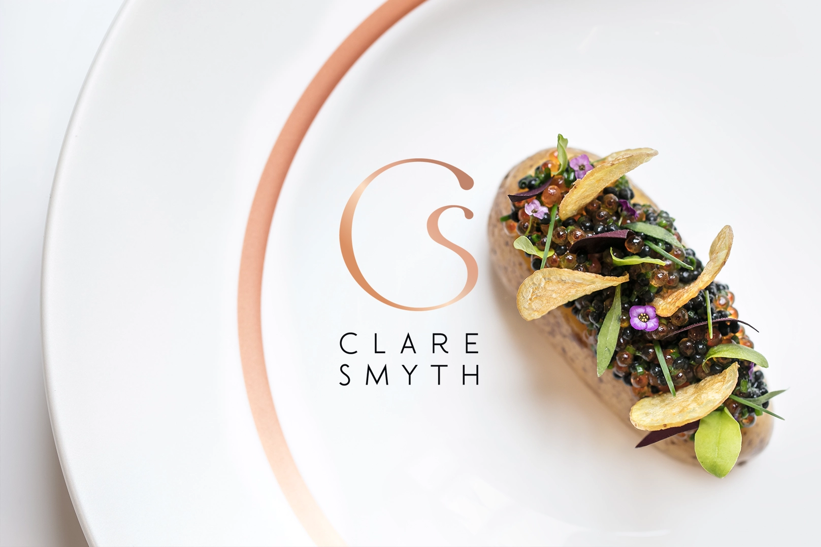
Clare wanted a brand identity that embodied her own passions and personality. A brand that would sit alongside her restaurant brand. The outcome; a modern version of the classic monogram. A clean and sophisticated colour palette and a set of brand guidelines demonstrating the logo’s versatility.